The Thumbnail Test: Designing Strong Art Before Adding Detail
Detail can make an image impressive at close range, but composition decides whether anyone wants to look closer. From across a room—or as a small thumbnail on a screen—an artwork first reads as a pattern of large light and dark shapes. If that pattern is confusing, careful texture and accurate eyelashes cannot repair the underlying design.
The useful news is that composition can be tested cheaply. A few rectangles, circles, wedges, and empty spaces are enough to reveal whether an idea has structure.
Reduce the subject to a shape statement
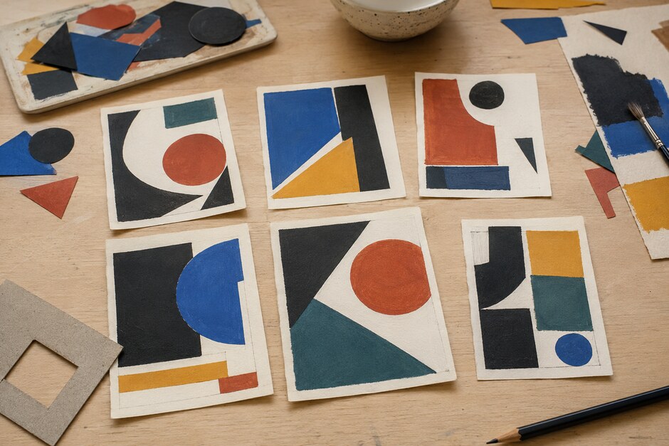
Begin by drawing a box in the proportions of the final artwork. Inside it, ignore object names. A tree may become a dark vertical mass, a face an oval interrupted by shadow, and a table a broad horizontal wedge. Combine small pieces whenever possible. Ten separate leaves are harder to organize than one canopy shape with a few deliberate breaks.
Fill the biggest two or three masses with a marker or soft pencil. Hold the thumbnail at arm’s length. You should still be able to describe its main action: a diagonal rise, a central block surrounded by air, or several small forms gathered against one large form.
Use three values before full color
Assign every important area to light, middle, or dark. This is not a permanent limit; it is a way to see the hierarchy. Grouping nearby values creates calm, while a sharp light-dark boundary creates attention.
Try at least two versions. In the first, connect most dark shapes into one family. In the second, connect the lights. The subject can remain identical while the emotional effect changes. A broad light field may feel open and quiet; a dominant dark field can feel enclosed or dramatic.
Choose a focal area—and reduce competition
A focal point is not simply the object you care about. It is the area where visual differences gather. Strong contrast, sharper edges, saturated color, unusual scale, and directional lines can all create emphasis. Use two or three of these signals together in one place instead of distributing them evenly.
Then weaken a competing area. Lower its contrast, simplify its silhouette, soften an edge, or let it merge with the background. Composition improves as much through subtraction as addition.
Design the negative space
The gaps between objects are active shapes. Look at the wedge of sky between buildings, the opening inside a bent arm, or the strip of table around a cup. Awkward tangencies often appear here: two edges barely touch, a corner points directly at another corner, or a narrow gap becomes an accidental line.
Shade the empty areas around your subject instead of the subject itself. If the negative shapes vary in size and remain easy to read, the positive forms will usually feel more intentional.
Create rhythm with repetition and interruption
Repeated sizes, angles, or intervals guide the eye. A row of windows, a sequence of heads, or several curved branches can establish a beat. Perfect repetition, however, becomes mechanical. Change one interval, enlarge one shape, or reverse one direction to create emphasis.
Think of rhythm as expectation followed by a meaningful break. The repeated elements provide unity; the interruption gives the viewer a reason to pause.
Run a six-thumbnail test
Before committing to a finished piece, make six thumbnails no larger than a playing card. Change one structural decision in each:
- Place the subject high in the frame.
- Place it low and give more room above.
- Crop closely so forms leave the edges.
- Use one large mass against several small ones.
- Build the image around a diagonal movement.
- Emphasize an unusual negative shape.
Spend no more than two minutes on each version. Speed prevents rendering from disguising weak decisions. Circle the thumbnail that reads most clearly, then make one larger study to resolve its value pattern.
Check the design during the final work
Composition does not end after planning. Details can slowly equalize the image until every surface demands attention. Step back regularly, view the artwork in a mirror, or photograph it and shrink it on screen. Ask whether the original large shapes are still visible.
Before finishing, check four things: one area leads, the value groups remain distinct, repeated forms include variation, and the empty spaces feel chosen. If those relationships work, detail can enrich them. If they do not, return to the shapes. The simplest version of the image usually tells you what needs to change.