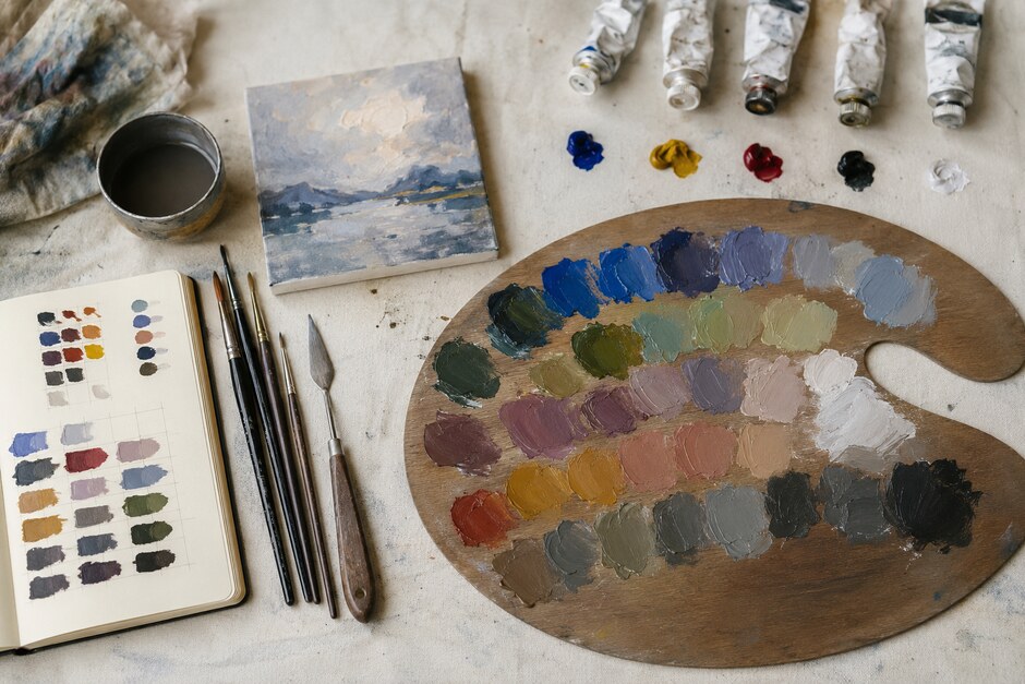
Five Tubes, Thirty Days: A Practical Acrylic Color Lab
Buying another tube of paint can feel like progress, but a crowded palette often makes color harder to understand. When every problem has a premixed answer, you miss the useful moment when one color leans warm, another pushes cool, and a tiny adjustment changes the entire relationship. A limited-palette month slows that moment down. It gives you enough repetition to recognize mixtures instead of guessing at them.
The aim is not to create a flawless color wheel. It is to build a working vocabulary you can use when painting real subjects.
Choose five colors with distinct jobs
Start with titanium white, a clear yellow, a warm red, ultramarine blue, and burnt umber. Exact brands matter less than consistency: use the same tubes for the full month. White controls tint and opacity. Yellow, red, and blue give you a broad mixing range. Burnt umber quickly lowers intensity and makes practical darks without forcing every shadow toward black.
Before painting, place a small sample of each color on paper and note how it behaves. Is the red slightly orange or violet? Does the blue become chalky when mixed with white? These biases explain why two apparently correct primaries can produce very different greens or purples.
Week one: build a map, not a decoration
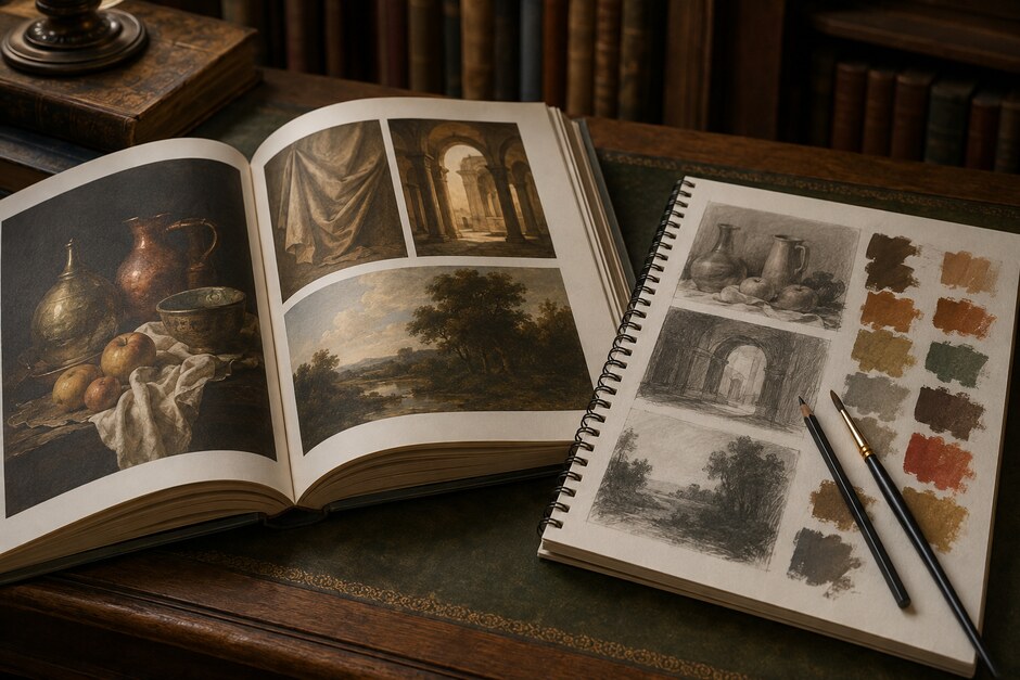
Divide a sheet into small boxes and mix two colors at a time. Keep one color dominant, then gradually increase the second. A yellow-to-blue row, for example, should travel through yellow-green, balanced green, blue-green, and finally near-blue. Make a second row with white added to every mixture. The lighter tints often reveal undertones that are difficult to see in thick paint.
- Label the colors and approximate ratios while the page is fresh.
- Use a clean knife or brush for each new mixture.
- Leave a small gap between swatches so neighboring colors do not distort your judgment.
- Let the chart dry before deciding which mixtures are useful; acrylic often shifts slightly as it cures.
Your chart should look like a record of experiments. Uneven edges and imperfect ratios are evidence, not mistakes.
Week two: match colors you can actually see
Abstract swatches become meaningful when you connect them to observation. Choose one ordinary object each day: a green mug, an apple, a cardboard box, a gray sock, or the shadow under a houseplant. Mix three versions of its main color. Make one too warm, one too cool, and one that appears closest.
Then compare the swatches with the object under the same light. Ask whether the error is mainly hue, value, or saturation. A green may look wrong because it is too bright, not because it needs more blue. In that case, a touch of burnt umber may solve the problem more cleanly than another primary.
Week three: organize value before nuance
Color is persuasive, so it can hide a weak light-dark structure. For each daily mixture, make a light, middle, and dark version. Photograph the row and view it in grayscale. If the three steps merge together, increase the separation.
Next, paint a simple object using only three value families. Keep the light side broad, combine small middle-value changes, and reserve the darkest accent for a contact shadow or focal edge. This restriction teaches you to mix for a visual role rather than chase every small variation.
Week four: turn the archive into paintings
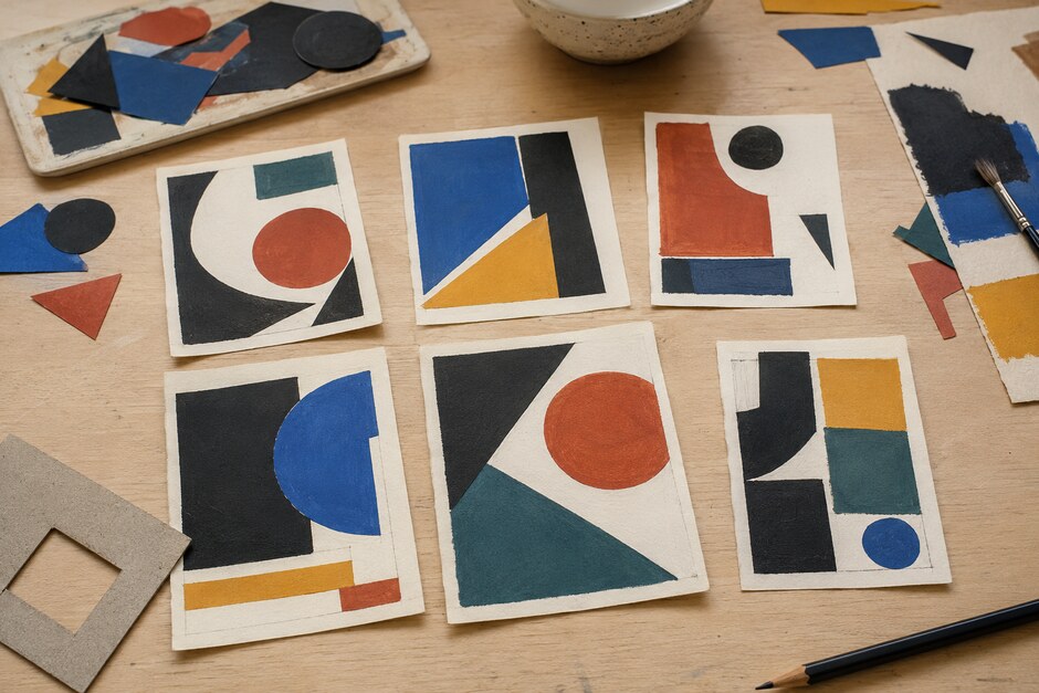
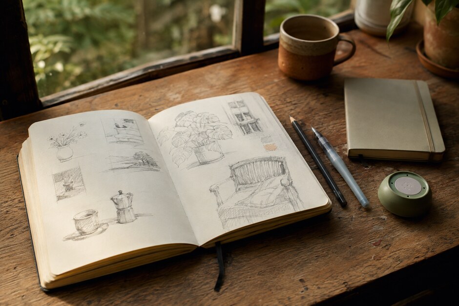
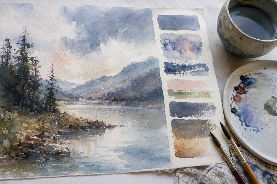
Use the final ten days for postcard-size studies. Select a swatch combination from earlier pages before you begin, then recreate it on the palette instead of inventing a new scheme. Paint a still life, a window view, or a small landscape from reference. Limit each study to thirty or forty minutes so the main color relationships remain more important than detail.
After every painting, add two notes to the chart: which mixture carried the picture, and which one was difficult to repeat. That feedback makes the archive personal. A commercially printed color wheel cannot tell you that your favorite foliage neutral begins with ultramarine and umber, or that a particular violet needs far less red than expected.
Finish with a palette you can explain
On day thirty, arrange six to ten mixtures that you would confidently use again. Give each a practical description such as “cool window shadow,” “muted leaf light,” or “warm skin neutral.” The names do not need to be universal. They only need to remind you how the color behaved.
A useful palette is not the one with the most options. It is the one whose options you understand. After a month of controlled mixing, you will still discover surprises—but they will feel like informed choices rather than accidents.